
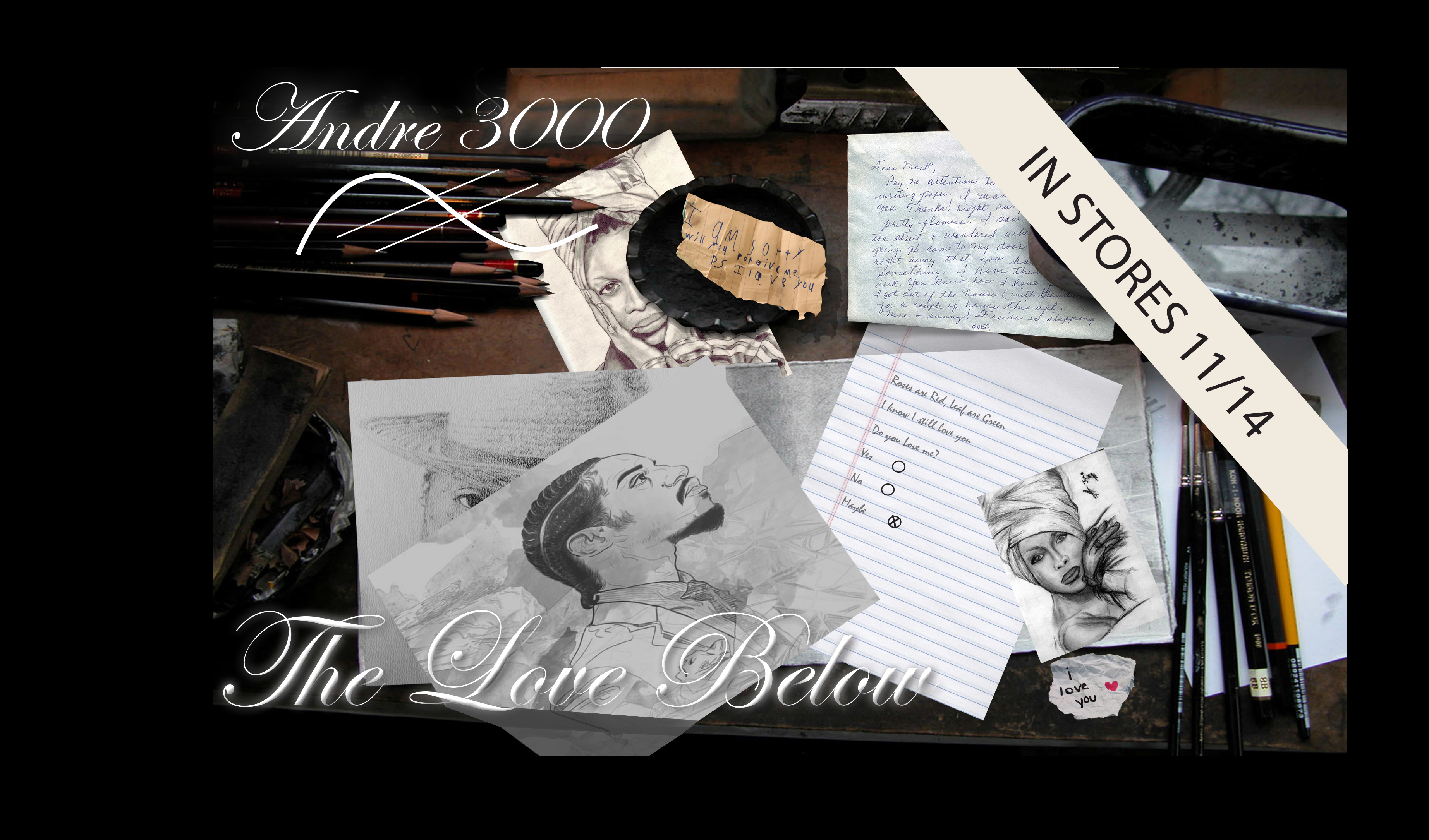


This project was an advertisement for an artistic magazine.
Use of a digital illustration that would be used to replace a photo. Creating a not-so-realistic image of a tooth and toothpaste, I rendered this piece.

This 2d illustration was for a page from a children’s book done with water color for the media.

This case study was done to should the simplicity of depth conveyed through the use of color. Flatten images can be placed over each other and dimension can be created through use of colors.

Characterization of Steve Harvey. The media is markers on poster board.



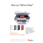
XYZ printing Company created a new all-in-one 3d printed that is user friendly for the everyday person. It is ready to use right out the box. With the built in scanner you can scan you favorite items and reproduce it with ease. This ad was created to introduce this new product to consumers.
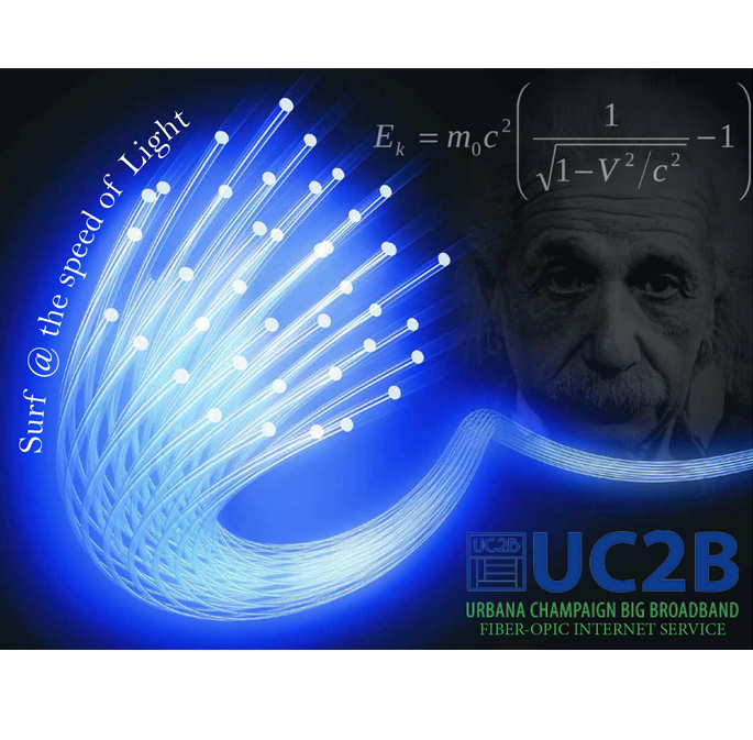
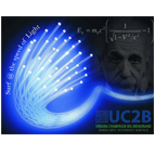
This was a class assignment to advertise a local buisness. The Company installs Fiberoptics for a internet service in our area.
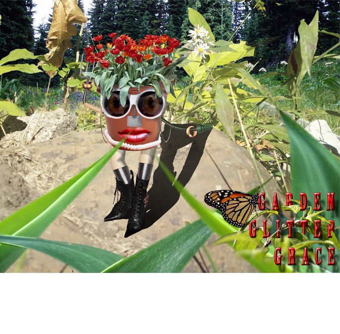
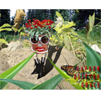
For this project I utilized images from different photos to create a realistic idea of a thought. This image is compiled of over 42 layers combined to look like one image.
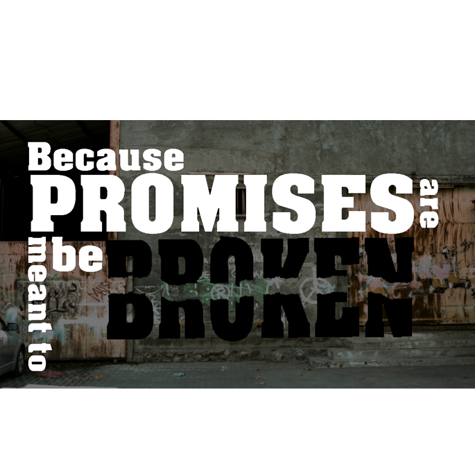
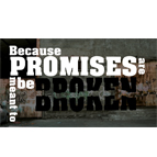
This class project was an animation of a clip that uses typography to convey a message with the words. I choose the rap battle between Arsenal and DNA. This elaborate use of words work well with the animation. Click here to see animation.
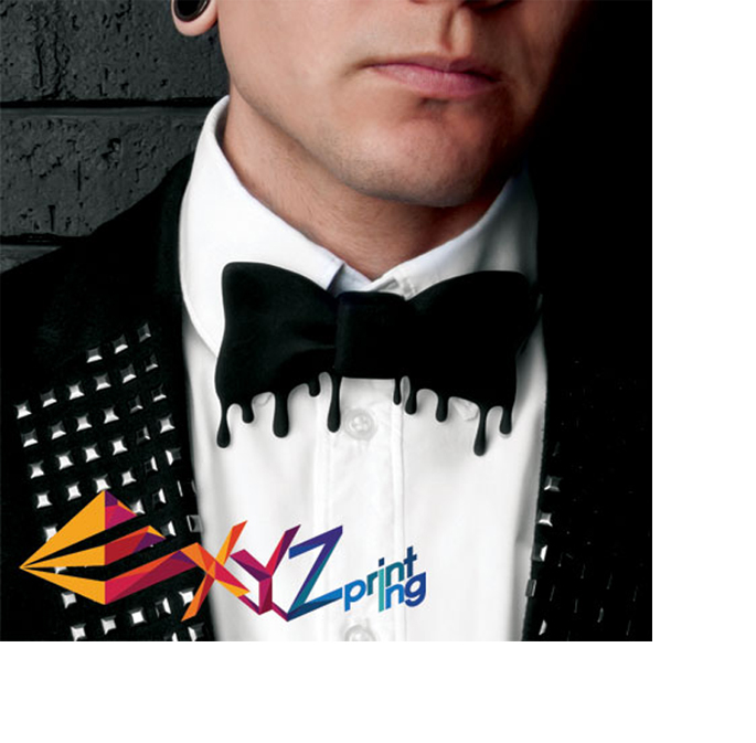
The Tie is a 3d Printed tie. It is not a photo alteration. It is a real photo on a bow-tie that has been created and printed using the capablities of a 3d printer. Showing another of the capabilities of the 3d Printer.
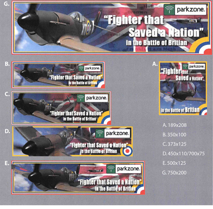
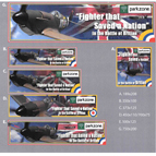
At Horizon Hobby I did a short internship which I created these web banners for a new product. The produce R/C products. This plane was a replica of a british plane along with the required wording.

This brochure was a design for a company that provides safe clean drinking water to water poverty communities. They offer multiple containers that purify natural water sources and make it drinkable. This brochure informs and promotes their Products.

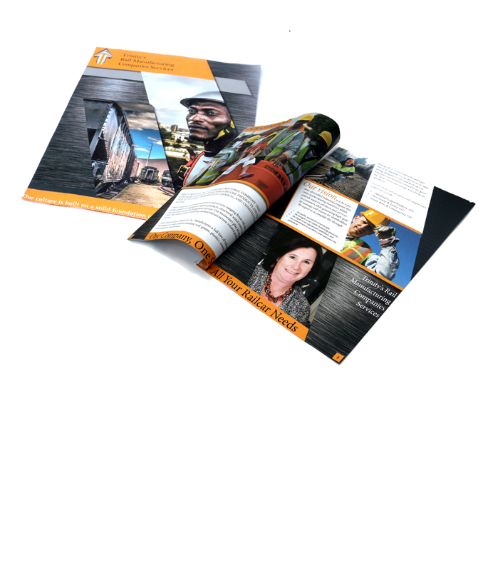
This project was a rebranding for the company Trinity Industries, a railway manufacturing company that build customized railcars. They have diverse industrial manufacturing branches that makeup the company, so the new logo needed to be diverse. The rebranding needed to incorporate a more family atmosphere and be more appealing to smaller community based business to be able to branch out side their community.
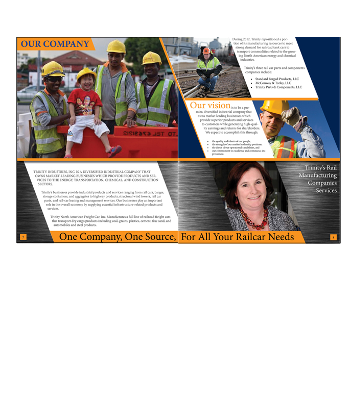
This project was a rebranding for the company Trinity Industries, a railway manufacturing company that build customized railcars. They have diverse industrial manufacturing branches that makeup the company, so the new logo needed to be diverse. The rebranding needed to incorporate a more family atmosphere and be more appealing to smaller community based business to be able to branch out side their community.

Rebranding this company required an updated logo that portrade the industrial factor of the company while being an appealling symbol to the public. The Steel texture and upward arrow like symbol does a good job depicting this forward thinking process that the company is headed.

Rebranding this companies idientiy to the public I updated the web site to a more user freindly application. A Single page that is easliy narratable to the different agancies of the company. Visually appealing to the visiter and informative to the anyone that has a stake in the company. A simplified color scheme with identifing images, sperating the information in oranized blocks of text. This updated web page bring the company up to todays stardard of a industrial companies web page.

The direct mailer is a promotional for the copmanies new devision that build customized Railcars to fit any specific need of a customer. Carring over the diaganals and color scheme, this mailer gives an illustration of the creativity of the companies ability to cusomize a car for their customers.

Nullam bibendum odio a sem bibendum, ut vestibulum ipsum porttitor. Sed finibus nec orci et cursus. Vestibulum facilisis rhoncus tempor. Duis non ipsum volutpat, rhoncus nisi sed, pulvinar ex. Aenean semper augue at lorem mattis, ac tempor leo mattis. Donec feugiat in sem sed pellentesque. Aliquam id ultricies augue.
Nullam bibendum odio a sem bibendum, ut vestibulum ipsum porttitor. Sed finibus nec orci et cursus. Vestibulum facilisis rhoncus tempor. Duis non ipsum volutpat, rhoncus nisi sed, pulvinar ex. Aenean semper augue at lorem mattis, ac tempor leo mattis. Donec feugiat in sem sed pellentesque. Aliquam id ultricies augue.
Nullam bibendum odio a sem bibendum, ut vestibulum ipsum porttitor. Sed finibus nec orci et cursus. Vestibulum facilisis rhoncus tempor. Duis non ipsum volutpat, rhoncus nisi sed, pulvinar ex. Aenean semper augue at lorem mattis, ac tempor leo mattis. Donec feugiat in sem sed pellentesque. Aliquam id ultricies augue.
Nullam bibendum odio a sem bibendum, ut vestibulum ipsum porttitor. Sed finibus nec orci et cursus. Vestibulum facilisis rhoncus tempor. Duis non ipsum volutpat, rhoncus nisi sed, pulvinar ex. Aenean semper augue at lorem mattis, ac tempor leo mattis. Donec feugiat in sem sed pellentesque. Aliquam id ultricies augue.
Nullam bibendum odio a sem bibendum, ut vestibulum ipsum porttitor. Sed finibus nec orci et cursus. Vestibulum facilisis rhoncus tempor. Duis non ipsum volutpat, rhoncus nisi sed, pulvinar ex. Aenean semper augue at lorem mattis, ac tempor leo mattis. Donec feugiat in sem sed pellentesque. Aliquam id ultricies augue.
Nullam bibendum odio a sem bibendum, ut vestibulum ipsum porttitor. Sed finibus nec orci et cursus. Vestibulum facilisis rhoncus tempor. Duis non ipsum volutpat, rhoncus nisi sed, pulvinar ex. Aenean semper augue at lorem mattis, ac tempor leo mattis. Donec feugiat in sem sed pellentesque. Aliquam id ultricies augue.





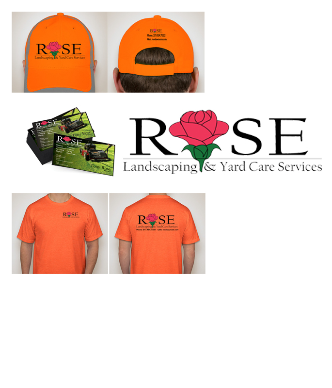
A local lawn service company needed a logo created.
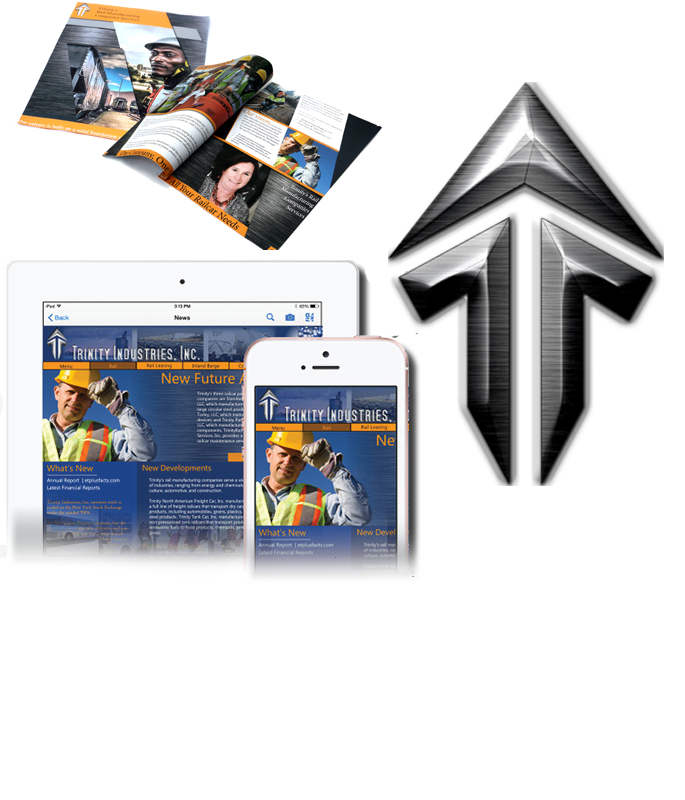
Trinity original logo is simple and lacking a more appealing look. I created a more industrial logo that has a contrasting look to the railroad industry that the company deals in.
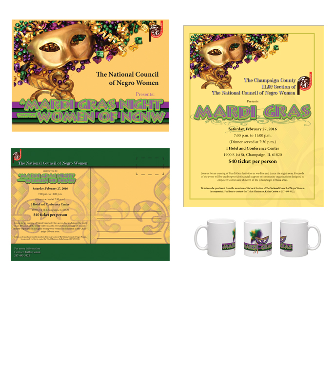
The Ladies of NCNW of the Champaign Chapter annual fundraiser event was themed after the New Orleans Mardi Gras. I was asked to create a logo, letterhead, envelopes, Flyers and gifts that all incorporate this theme.
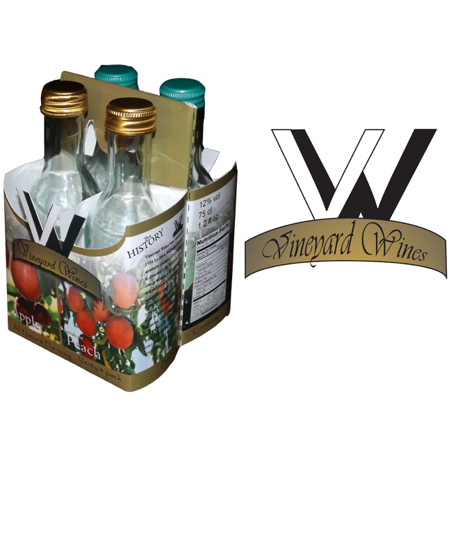
Vineyard Wines is an imaginary company that I created a logo and the packaging design. It has 4 bottes that are 4oz. Each bottle has a different flavor and theme to match the flavor while keeping with the overall imagery of the packaging and company design.

This Logo design is for a Barbeque restaurant in Illinois that specializes in Kansas City style recipes.
Nullam bibendum odio a sem bibendum, ut vestibulum ipsum porttitor. Sed finibus nec orci et cursus. Vestibulum facilisis rhoncus tempor. Duis non ipsum volutpat, rhoncus nisi sed, pulvinar ex. Aenean semper augue at lorem mattis, ac tempor leo mattis. Donec feugiat in sem sed pellentesque. Aliquam id ultricies augue.





Nullam bibendum odio a sem bibendum, ut vestibulum ipsum porttitor. Sed finibus nec orci et cursus. Vestibulum facilisis rhoncus tempor. Duis non ipsum volutpat, rhoncus nisi sed, pulvinar ex. Aenean semper augue at lorem mattis, ac tempor leo mattis. Donec feugiat in sem sed pellentesque. Aliquam id ultricies augue.
Nullam bibendum odio a sem bibendum, ut vestibulum ipsum porttitor. Sed finibus nec orci et cursus. Vestibulum facilisis rhoncus tempor. Duis non ipsum volutpat, rhoncus nisi sed, pulvinar ex. Aenean semper augue at lorem mattis, ac tempor leo mattis. Donec feugiat in sem sed pellentesque. Aliquam id ultricies augue.
Nullam bibendum odio a sem bibendum, ut vestibulum ipsum porttitor. Sed finibus nec orci et cursus. Vestibulum facilisis rhoncus tempor. Duis non ipsum volutpat, rhoncus nisi sed, pulvinar ex. Aenean semper augue at lorem mattis, ac tempor leo mattis. Donec feugiat in sem sed pellentesque. Aliquam id ultricies augue.
Nullam bibendum odio a sem bibendum, ut vestibulum ipsum porttitor. Sed finibus nec orci et cursus. Vestibulum facilisis rhoncus tempor. Duis non ipsum volutpat, rhoncus nisi sed, pulvinar ex. Aenean semper augue at lorem mattis, ac tempor leo mattis. Donec feugiat in sem sed pellentesque. Aliquam id ultricies augue.
Nullam bibendum odio a sem bibendum, ut vestibulum ipsum porttitor. Sed finibus nec orci et cursus. Vestibulum facilisis rhoncus tempor. Duis non ipsum volutpat, rhoncus nisi sed, pulvinar ex. Aenean semper augue at lorem mattis, ac tempor leo mattis. Donec feugiat in sem sed pellentesque. Aliquam id ultricies augue.
Nullam bibendum odio a sem bibendum, ut vestibulum ipsum porttitor. Sed finibus nec orci et cursus. Vestibulum facilisis rhoncus tempor. Duis non ipsum volutpat, rhoncus nisi sed, pulvinar ex. Aenean semper augue at lorem mattis, ac tempor leo mattis. Donec feugiat in sem sed pellentesque. Aliquam id ultricies augue.
Nullam bibendum odio a sem bibendum, ut vestibulum ipsum porttitor. Sed finibus nec orci et cursus. Vestibulum facilisis rhoncus tempor. Duis non ipsum volutpat, rhoncus nisi sed, pulvinar ex. Aenean semper augue at lorem mattis, ac tempor leo mattis. Donec feugiat in sem sed pellentesque. Aliquam id ultricies augue.
Nullam bibendum odio a sem bibendum, ut vestibulum ipsum porttitor. Sed finibus nec orci et cursus. Vestibulum facilisis rhoncus tempor. Duis non ipsum volutpat, rhoncus nisi sed, pulvinar ex. Aenean semper augue at lorem mattis, ac tempor leo mattis. Donec feugiat in sem sed pellentesque. Aliquam id ultricies augue.
Nullam bibendum odio a sem bibendum, ut vestibulum ipsum porttitor. Sed finibus nec orci et cursus. Vestibulum facilisis rhoncus tempor. Duis non ipsum volutpat, rhoncus nisi sed, pulvinar ex. Aenean semper augue at lorem mattis, ac tempor leo mattis. Donec feugiat in sem sed pellentesque. Aliquam id ultricies augue.
Nullam bibendum odio a sem bibendum, ut vestibulum ipsum porttitor. Sed finibus nec orci et cursus. Vestibulum facilisis rhoncus tempor. Duis non ipsum volutpat, rhoncus nisi sed, pulvinar ex. Aenean semper augue at lorem mattis, ac tempor leo mattis. Donec feugiat in sem sed pellentesque. Aliquam id ultricies augue.
Nullam bibendum odio a sem bibendum, ut vestibulum ipsum porttitor. Sed finibus nec orci et cursus. Vestibulum facilisis rhoncus tempor. Duis non ipsum volutpat, rhoncus nisi sed, pulvinar ex. Aenean semper augue at lorem mattis, ac tempor leo mattis. Donec feugiat in sem sed pellentesque. Aliquam id ultricies augue.
Nullam bibendum odio a sem bibendum, ut vestibulum ipsum porttitor. Sed finibus nec orci et cursus. Vestibulum facilisis rhoncus tempor. Duis non ipsum volutpat, rhoncus nisi sed, pulvinar ex. Aenean semper augue at lorem mattis, ac tempor leo mattis. Donec feugiat in sem sed pellentesque. Aliquam id ultricies augue.